

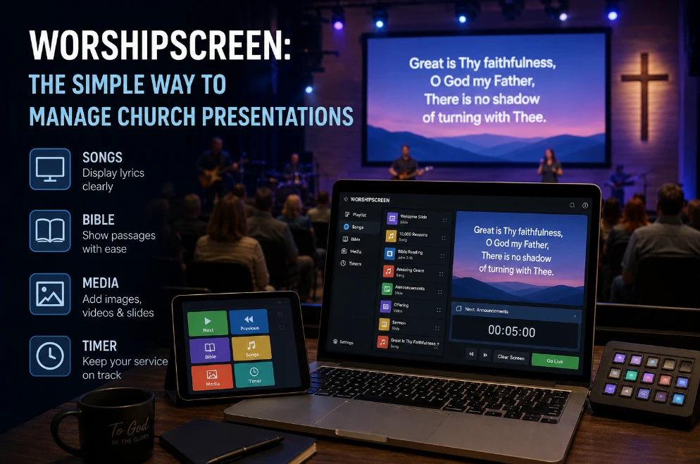
Church presentation is often treated as a technical task: put the lyrics on the screen, display the Bible verse, advance the sermon slides, and make sure the video plays.
But for the congregation, the screen is part of the Sunday experience.
When the presentation is difficult to read, appears too early, changes at the wrong moment, or contains outdated information, people notice the technology instead of focusing on worship and teaching. When everything works naturally, the presentation almost disappears into the service.
That makes presentation quality less about having expensive equipment and more about creating a system that supports what is happening in the room.
Table of Contents
1. Design for Participation, Not Decoration
The first question for every worship slide should be:
What does the congregation need to do with this information?
During worship, people need to read lyrics quickly.
During a sermon, they may need to identify a Bible reference or remember a key statement.
During announcements, they need to understand essential information before it disappears.
Each situation requires a different approach.
A beautiful background does not compensate for unreadable text. A complicated animation does not make an announcement clearer.
Effective church presentation design starts with the purpose of the content.
2. Make Every Screen Understandable in Seconds
People do not study worship slides like a website.
They glance at the screen while singing, listening, standing, or sitting.
That means the information hierarchy needs to be obvious immediately.
For worship lyrics, the words should dominate the screen.
For Scripture, the passage should be the primary element, with the reference easy to identify.
For sermon slides, the key idea should be visible without forcing the congregation to read a paragraph.
A useful rule is to remove anything that does not help the audience understand the current moment.
3. Match the Presentation to the Pace of the Service
A presentation should follow the rhythm of the room.
During a fast worship song, lyric changes may need to happen frequently.
During a sermon, a slide may remain on screen for several minutes.
During prayer, a static and quiet visual may be more appropriate than constant movement.
This is why a Sunday presentation should not be treated like an ordinary slideshow.
The operator needs to understand what is happening on stage.
The worship leader may repeat a chorus. The pastor may pause. A musician may extend an instrumental section.
The presentation has to respond to the service rather than forcing the service to follow a predetermined sequence.
4. Give Worship Leaders and Media Teams the Same Plan
Many presentation mistakes are communication mistakes.
The worship team may know that a bridge will be repeated twice, while the presentation operator assumes it will happen once.
The pastor may decide to return to a previous Scripture passage, while the operator is already preparing the next sermon slide.
A shared service plan reduces these situations.
Before Sunday, confirm:
- Song order
- Song arrangements
- Repeated sections
- Bible references
- Sermon structure
- Videos
- Special transitions
This does not need to become a complicated meeting.
A clear service plan can be enough.
5. Replace Slide Hunting With Instant Navigation
One of the most frustrating experiences for a congregation is watching a volunteer search for the correct slide.
It usually happens when content is organized as a large collection of unrelated files.
A live church presentation system should make navigation based on the service, not the computer’s file structure.
The operator should be able to see what is currently happening and quickly access the next or previous element.
This is particularly important when worship becomes spontaneous.
A good worship presentation software workflow can make it easier to organize songs, Scripture, and other service content so the operator is not constantly searching through separate files.
6. Treat Long Bible Passages Differently From Lyrics
Not all presentation content should be formatted in exactly the same way.
A short worship lyric may fit comfortably into several lines.
A Bible passage may require much more text.
Trying to use one layout for everything usually produces poor results.
For longer Scripture passages, divide the content into logical sections.
Keep the reference visible.
Use enough spacing to make the passage comfortable to read.
Avoid reducing the font simply to fit more words onto one screen.
If a passage needs three screens instead of one, use three screens.
The congregation benefits from readable information more than from fewer slide changes.
7. Make Announcements Brief and Actionable
Church announcements often become overloaded.
A single slide may contain an event name, date, time, location, description, contact details, website, QR code, and several paragraphs of additional information.
People rarely have enough time to read all of it.
Instead, identify the action the congregation needs to take.
For example:
Men’s Breakfast
Saturday, 9:00 AM
Church Fellowship Hall
Register by Wednesday
That is much easier to process than a paragraph.
If more information is required, the announcement can point people toward a website, printed material, or another communication channel.
What About Videos?
Video content needs a separate preparation process because it involves both visual and audio elements.
Before Sunday, check the actual file on the actual presentation computer.
Do not assume that because the video works on one laptop it will work correctly through the church’s display system.
Verify:
- Picture
- Audio
- Aspect ratio
- Playback
- Start position
- File location
If the video requires an internet connection, consider whether a local copy can be used instead.
A thirty-second video should not create a five-minute technical interruption.
Use Technology to Reduce Preparation, Not Increase It
A church can easily accumulate software.
One program manages lyrics. Another handles Scripture. A third is used for sermon slides. Videos are played through another application.
Each program may work perfectly on its own.
The problem is the workflow between them.
Every additional tool creates another interface, another process, and another thing a volunteer must learn.
For churches considering church presentation software, the better question is not “How many features does it have?”
Ask instead:
How much work does it remove from our weekly process?
If volunteers can prepare and operate more of the service from one organized environment, the practical benefit can be much greater than simply adding another piece of technology.
The Most Important Test Happens From the Back Row
Media teams naturally inspect presentations from the operator’s position.
That is not enough.
The congregation experiences the presentation from the seats.
Before Sunday begins, walk to the back of the room.
Look at a normal worship lyric.
Then look at the longest Bible passage.
Then check an announcement.
If the smallest text is difficult to read, fix it before the service.
Also check whether stage lighting affects visibility.
A dark background that looks excellent on a computer monitor may become almost invisible in the sanctuary.
Build a Presentation That Can Survive a Change of Plan
The ideal Sunday service rarely happens exactly as originally planned.
A song may be removed.
A sermon may be shortened.
A pastor may add a passage.
A video may be skipped.
A good presentation workflow should absorb these changes.
This is why live presentation control is more important than creating a perfectly linear slide deck.
The operator needs freedom to move backward, skip content, repeat sections, or jump to another part of the service.
Flexibility is not a luxury during worship. It is part of reliable operation.
A Practical Upgrade Path for Churches
A church does not have to change everything at once.
Start with the area causing the greatest number of problems.
If worship lyrics take too long to prepare, improve the lyric workflow.
If Bible passages are difficult to manage, improve Scripture presentation.
If volunteers constantly switch between applications, look for a more integrated system.
If new operators struggle to learn the current setup, prioritize simplicity.
This approach makes technology decisions based on actual ministry needs rather than trends.
When the Screen Stops Being a Distraction
The best presentation is rarely the one people talk about after the service.
Instead, people should be able to sing without losing their place, follow Scripture without struggling to read it, understand announcements quickly, and see sermon points at the right moment.
That requires more than good graphic design.
It requires accurate content, thoughtful formatting, reliable equipment, trained volunteers, and presentation software that supports the way the church actually conducts its services.
When those elements work together, the screen becomes part of the service rather than a separate technical production happening in the background. That is the real purpose of modern church presentation technology: helping people participate more easily while giving volunteers a simpler and more reliable way to support every Sunday service.
